Board of Trustee Accountability Data
Clicking on an image below will open the Interactive Report in a new tab. The Interactive Reports are better viewed on a large screen (e.g., tablet, pc, or mac).

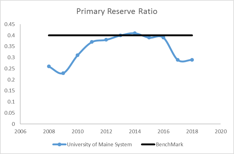
The Primary Reserve Ratio provides a snapshot of financial strength and flexibility by indicating how long the institution could function using its expendable net position (both unrestricted and restricted, excluding net position restricted for capital investments) without relying on additional net position generated by operations. This ratio is calculated as follows:
Expendable Net Position*/Total Expense
* Excluding net position restricted for capital investments
Data illustrate UMS was close to its benchmark for four years and then dropped in the last two.
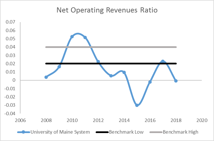
The Net Operating Revenues Ratio is a measure of operating results and answers the question, “Do operating results indicate that the University is living within available resources?” Operating results either increase or decrease net position and, thereby, impact the other three core ratios: Primary Reserve, Return on Net Position, and Viability. This ratio is calculated as follows:
Operating Income (Loss) plus Net Non‐Operating Revenues (Expenses) / Operating Revenues plus Non‐Operating Revenues
Data illustrate UMS is out of its benchmark range, improving for years and then turned down in 2018.
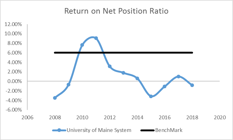
The Return on Net Position Ratio measures asset performance and management. It determines whether an institution is financially better off than in the previous year by measuring total economic return. It is based on the level and change in total net position. An improving trend in this ratio indicates that the institution is increasing its net position and is likely to be able to set aside financial resources to strengthen its future financial flexibility. This ratio is calculated as follows:
Change in Net Position /Total Beginning of the Year Net Position
Data illustrate UMS is below its benchmark and is trending down.
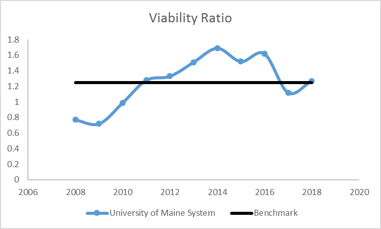
The Viability Ratio measures expendable resources that are available to cover debt obligations (e.g., capital leases, notes payable, and bonds payable) and generally is regarded as governing an institution’s ability to assume new debt. This ratio is calculated as follows:
Expendable Net Position* / Long‐Term Debt
* Excluding net position restricted for capital investments
Data illustrate UMS is close to its benchmark.
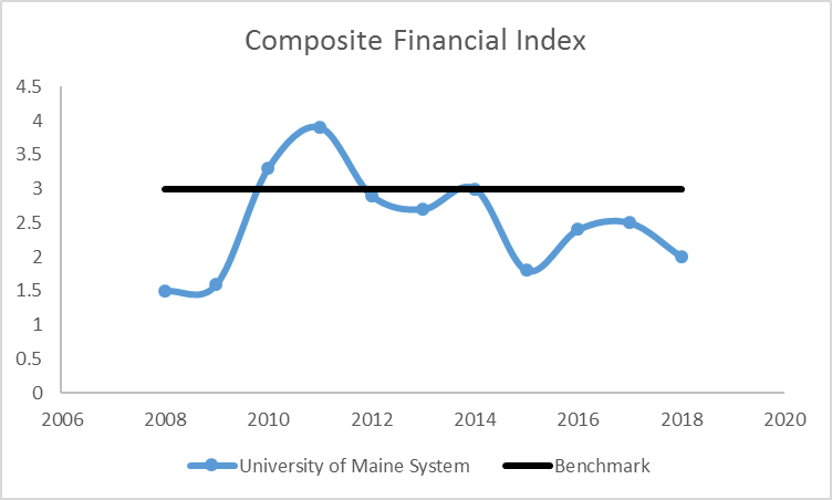
The Composite Financial Index (CFI) creates one overall financial measurement of the institution’s health based on the four core ratios: primary reserve ratio, net operating revenues ratio, return on net position ratio, and viability ratio. By blending these four key measures of financial health into a single number, a more balanced view of the state of the institution’s finances is possible because a weakness in one measure may be offset by the strength of another measure. The CFI is calculated by completing the following steps:1. Compute the values of the four core ratios;
2. Convert the ratio values to strength factors along a common scale;
3. Multiply the strength factors by specific weighting factors; and
4. Total the resulting four numbers (ratio scores) to reach the single CFI score.
Data illustrate UMS is close to its benchmark, fluctuating above and below the benchmark over time, and has had a trend downward for six years.
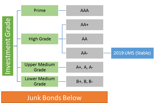
UMS has a AA- Standard and Poors debt rating; meaning UMS has a very high capacity to repay its loans due to financial position and attitude towards repaying debt. UMS is considered to have a very low chance of defaulting. A “stable outlook” means that a rating is not likely to change.
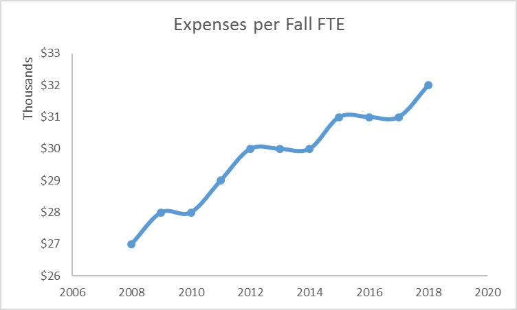
Data illustrate the total expenses per fall student FTE over time. The data is trending upward for a ten year period
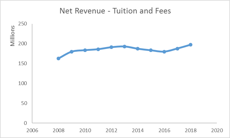
Data illustrate net revenue of tuition and fees over time. The data fluctuates between 165 million and 195 million, with a trend upward for the last two years.
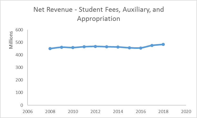
Data illustrate net revenue of student fees, auxiliary, and appropriation over time. The data fluctuates between 450 million and 485 million.
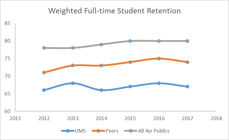
Data illustrate the average full-time student retention rates for UMS, UMS Peers, and the all Public 4-year institutions. In 2017 the weighted full-time student retention rates were 71% for UMS, 75% for UMS Peers, and 81% for all Public 4-year institutions.
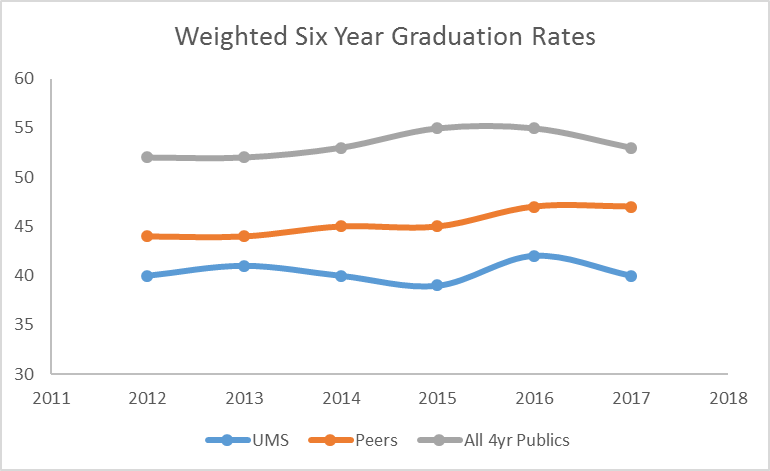
Data illustrate the average six year graduation rates for UMS, UMS Peers, and the all Public 4-year institutions. In 2017 the weighted six year graduation rates were 40% for UMS, 47% for UMS Peers, and 53% for Publics 4-year institutions.
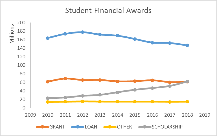
Data illustrate UMS proportion of financial aid awards; where loans is the largest portion, followed by grants, and scholarships. Scholarships had a significant increase over the last five years.
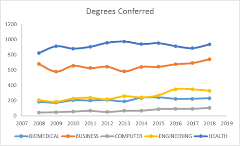
Data illustrate the number of degrees conferred for selected programs. In 2018 degrees conferred for Health fields was 936, Business fields was 741, Engineering fields was 327, Biomedical fields was 231, and Computer fields was 103.
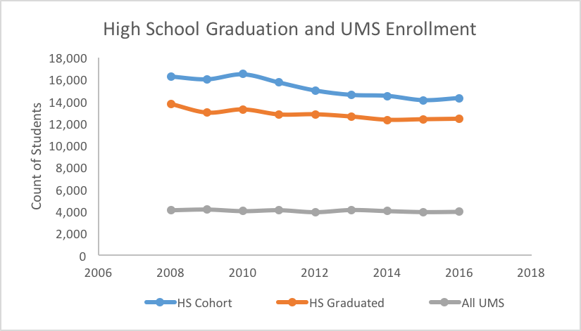
Data illustrate the number of students who were enrolled in high school, graduated high school, and enrolled in UMS. In 2016 there were 14k enrolled in high school. The trend is markedly down from 2008 which had 16k students enrolled in high school. In 2016 12k student graduated high school and 4k enrolled in UMS.
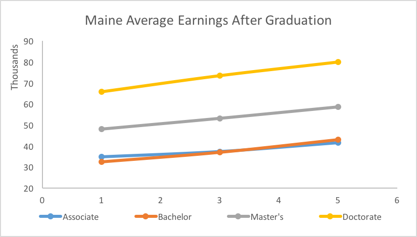
Data illustrate the average earnings of UMS students 1, 3, and 5 years after graduation. Doctorate degrees on average earn 65k year 1 and 80k year 5; Master’s degrees earn 48k year 1 and 59k year 5; Bachelor’s degrees earn 33k year 1 and 43k year 5; Associate degrees earn 35k year 1 and 42k year 5.
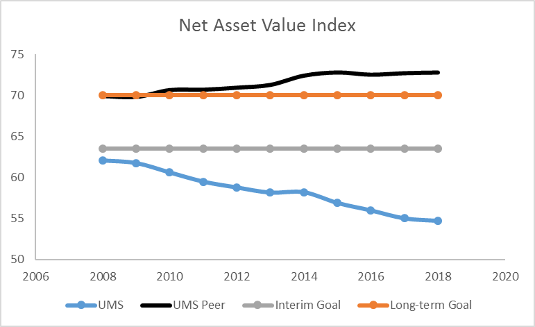
The NAV Index is an annual statistic that represents the overarching impression of campus condition and is calculated by subtracting the backlog from the current replacement value of the campus and the dividing by the replacement value: NAV Index = (Current Replacement Value – Asset Reinvestment Backlog)/Current Replacement Value. More specifically, it is the percent of campus that is in proper, working condition, or the actual value of a campus physical assets, not including those items that have already been deferred to the asset reinvestment backlog. An NAV Index of 100% is a school or building with no asset reinvestment backlog.
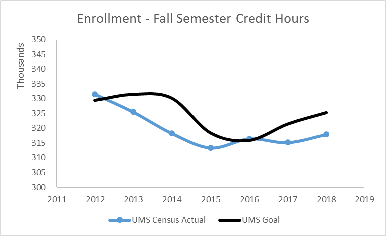
Fall semester credit hours are totaled as of census day each year. Census day normally occurs on October 15, which is well past the beginning of the semester. The Fall semester normally begins at the end of August, around August 28 or 29. The reason for delaying the reporting until census is that it allows time for student drops and withdrawals, so the total semester credit hours will more accurately reflect genuine enrollments. Additionally, using a standard census date throughout the system, allows for comparability at the system level. The graph illustrates semester credit hours across the system are trending down across the past six years and generally under the UMS goal.
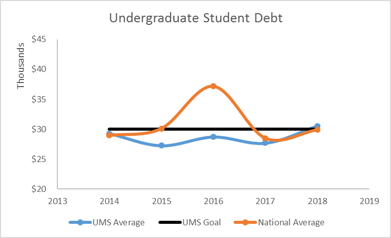
Student debt is the total of any loan program: Federal Perkins, Federal Stafford Subsidized and Unsubsidized, institutional, state, private loans that your institution is aware of, including both Federal Direct Student Loans and Federal Family Education Loans for all degree-seeking undergraduates.
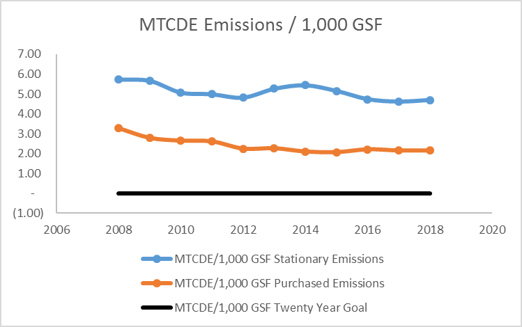
Metric Tons of Carbon Dioxide Equivalents (MTCDE) divide by 1,000 Gross Square Feet (GSF). The trend for stationary and purchased MTCDE emissions have declined. Stationary went from 2008 at 5.73 to 2018 at 4.69. Purchased went from 2008 at 3.29 to 2018 at 2.14. The twenty year goal for UMS is to have zero emissions.
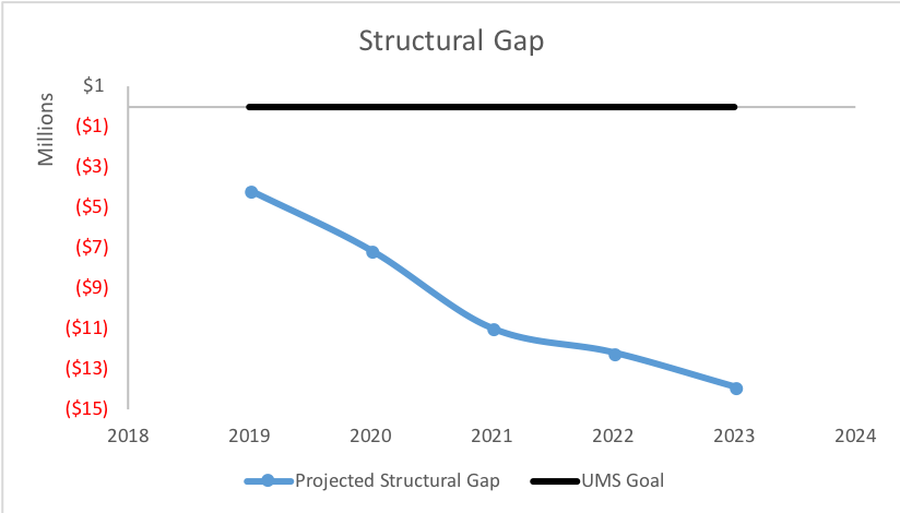
Each year the UMS Finance team performs a multi-year projection that estimates enrollment, tuition, sees, appropriation, compensation, benefits, capital expenses and non-compensation expenses to calculate the difference between revenues and expenses for future years. The formula is total revenues minus expenses. Where a negative value is a gap and a positive value is a surplus. The prediction indicates more expenses will be needed than revenues generated over the next five year period (i.e., the gap will become larger).
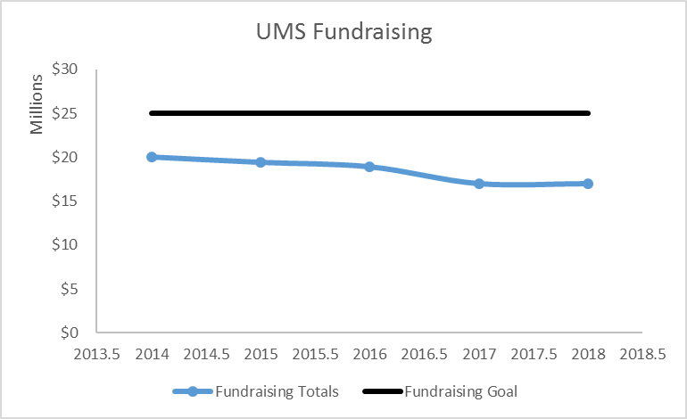
UMS total fundraising dollars for all seven institutions include all gifts such as; cash, checks and negotiable securities, and pledge payments. Gifts-in-kind and pledges receivable are not included in these totals. The trend has been downward over of the last seven years.
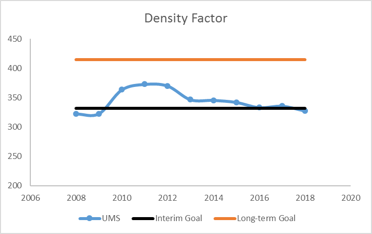
Density factor measures number of users per 100,00 GSF. Trend has been stable and very close to the interim goal